12/20/2018 - Wizard Progress Bar
This is a technical write up of a wizard progress bar component.
I'm Focusing on animating the component.
What's in it?
- Javascript to change class names.
- CSS transitions for animation.
- CSS sibling combinators make state tracking unnecessary.
demo - Try Me!
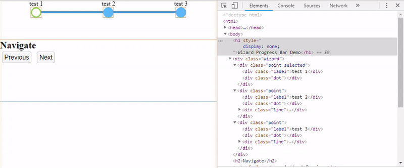
Above is a working version of the Wizard progress bar component.Try navigating next / previous, and adding / removing steps.
HTML
The HTML structure is barebones.
- There is an outer div for the wizard progress bar component.
- Inside the wizard are all of the progress bars points.
- Each point has a dot which indicates where the user is at.
- Each point has a label which is centered over the dot.
- Every point after the first has a line that is positioned before the dot.
- Inside each line is an internal div that indicates progress as the wizard is navigated.
  <div class="wizard">
    <div class="point selected">
      <div class="label">test 1</div>
      <div class="dot"></div>
    </div>
    <div class="point">
      <div class="label">test 2</div>
      <div class="dot"></div>
      <div class="line"><div></div></div>
    </div>
    <div class="point">
      <div class="label">test 3</div>
      <div class="dot"></div>
      <div class="line"><div></div></div>
    </div>
  </div>
The above code looks like this:
Interaction
As a user navigates the wizard progress bar a point is marked as selected.
This is all of the information needed for the stylesheet.
Styling
Core concept:
By default if no point is selected the state of the progress bar is green.
All of the line segments internal divs are width 100%.

In practice the bar is never put into a state where no point is selected.
When a point is selected:
- Set the background color of the selected dot to white.
- Set the background color of all dots after the selected point to blue.
- Set the width of the lines internal divs to 0% after the selected point.
background-color:white;
  .wizard .point.selected ~ .point .dot{
    background-color:blue;
  }
  .wizard .point.selected ~ .point .line div{
    width:0px;
  }
The tildes "~" denote a general sibling combinator and are supported back to Internet Explorer 7.
Here is a labeled pic of what's going on.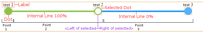
Transitions
CSS transitions are used to animate state change.
- In this case when the background color of a dot changes.
- And when the width of the internal line div changes.
.wizard .point .dot{
  transition:background-color 0.5s;
}
.wizard .point .line div{
  transition:width 0.6s;
}
The above snippets are all the code needed to animate the progress bar.
CSS Transitions:
- Do not tie up javascripts single thread.
- Are optimized by moving the work off to the GPU.
- Can be cancelled mid animation with the browser doing the work to resolve render state.
- Support for CSS transitions goes back to Internet Explorer 10.
- Fallback in older browsers is the transitions aren't animated.
Summary
That's all I want to cover today.
Hopefully I showcased some concepts that are useful for component creation.
By using basic html, class selectors, and css transitions; you can create interesting visual interactions.
CSS can do a lot of things that traditionally you might have used javascript to manually manipulate.